Tuesday, July 3, 2012

Happy 4th of July

The fourth of July is one of my favorite holidays.  I have the best family memories from this day.  This year it will be very different for me as this will be the first time I am away from home.  This will also be the first year without my amazing Grandpa.  Today reminds me so much of him and the pride and honor he felt for our country.  Pop I miss you everyday and will be thinking of you.

:::

Whenever I see the American Flag I think of my Pop and smile.  Here are some fun inspiring photos for the 4th of July and a couple DIY projects from some awesome blogs!  

Fun Luminaries
Fun Easy Wreath

Ferry ride to Catalina
:::

Last but absolutely not least, my favorite picture of my Grandpa on 4th of July in 2006. I love you and will be celebrating thinking of you!


Sunday, July 1, 2012

Food. And Design of Course.

A new little restaurant opened up down the road from my house.  Coronado has small little quaint places to eat and only a few kid friendly ones.  I am guessing that is what inspired the decision to open this little gem!  It is a hotdog restaurant! What kid doesn’t love hotdogs! What made me most excited when looking at the menu is that they also MAKE their own corndogs in fresh batter!! Ok so onto the design part. Can you tell that food is my other obsession?
Did I mention they also have sweet potato tots?!
:::
Besides the amazing food the design of the space is perfect.  The light colors they chose really brighten up the space.  They took out the front wall where the door is and put in a huge sliding door that is a full window.  The attention to the seating arrangement has changed the space from the restaurant it was before.  They lined the west wall with a counter to accommodate more guests and included booth and chair seating on the opposite side.  Narrow spaces are hard to design allowing for good traffic flow.  The placement of the ordering counter and the condiment station allows guests to enter and leave easily without much interruption. 
Love the colors on the wall

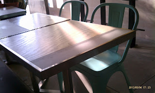
I'm obsessed with the industrial style of the chairs

The design of a restaurant can really make or break it for me.  If customers are not comfortable eating in the space the food really does not stand a chance.  It is a whole experience that they come for.  Service, atmosphere and taste!  Like some chefs say about food presentation, the customer is eating it when they see it, well before it enters the mouth.  I feel the same way with the experience of the restaurant.  Once I enter, either it excites me or makes me want to run screaming for the door.  Don’t get me wrong, I love dive hole in the wall restaurants with killer food, but those places I know what I am getting when I get there.
:::

The prior restaurant was dark and hard to navigate.  It was difficult to order and get seated without having to excuse yourself for being in everyone’s way. The new design with a fun menu has really changed this space.  Well done DeLish, well done!

Saturday, June 23, 2012

Catalina


Recently I got to do a bit of traveling and I was inspired by some of the beautiful details around the city of Avalon on Catalina Island.  This small little town is quite the tourist destination.  We were there for only one day on our way off the island but it was very beautiful.
:::
There was once a casino on the island that was turned into a movie theatre, and thank goodness because it is beautiful!!  
View from the hill

Inside the Theater
The details in the artwork on the walls and ceiling are beautiful as is the details on the chair backs. It’s whimsical and takes your breath away. It is the little things that make such a difference inside. The ceiling has small twinkle lights that come on when the lights go down to give a little night time twinkle to the high ceiling. What a perfect touch!
:::
All around town the Spanish influence on the archways as well as the tile details. I love the spanish colors. I have these sparatically throughout my home.

Tile Detail

There are fountains in the middle of the intersections, you know the ones that remind you of being a child and throwing those pennies into the water and wishing that wish that you know will come true someday. The detail of the tile and the size makes them perfect accents for this little town.  
Fountain in the middle of the square

The experience and the relaxing feeling this town gives was perfect for our weekend getaway. 

Thursday, May 31, 2012

It's Not All Textbook

Sometimes we get caught up on the design specifics for spaces we live in.  What colors do I want to use? Will that color work with what I already have? How can I fit my furniture in the space?  There was a reason we chose to live there, there was something in this space that pulled you in.  I knew right when I walked in my apartment that this was the space.  Of course the original cabinets in the kitchen and the hardwood floors were huge aesthetic selling points for me, but overall it was cozy and quaint, it fit my personality and style.


My roommate and I are very different when it comes to design styles.  She loves bright bold colors and I am natural and classic. These can be issues when living with roommates since you want to make the space comfortable for both of you. The best part about our combination is somehow we make it work.  The apartment has a flow and a comfort to it little elements throughout the space tie the whole home together.


Here are some images where color and style when seen separately, you wouldn't think they could work well together, but, they do!
:::

Would you think a stacked wood wall would work with an Eiffel tower legged chair (originally designed by Eames in the 50's) paired with the vintage tulip based table and cement wall?  Probably not but they do. And they work oh so very well.  This space is a perfect example of different elements and styles working in one space. 


<><> <><> <><>
parliament design offices - Portland, OR or by ooh_food on Flickr
:::


The kitchen below combines elements that if listed on paper I would have never put in the same space, but look at it, this kitchen is beautiful! The striking island with the chrome top is a great focal point.  The chocolate cabinets are mimicked in the floor tile mosaic.  After the mind travels all around the room, you look up and see the tin style ceiling!  This very different than classic lines of the cabinets and the modern style of the island.  This design is far from traditional but works well. The red island will be a conversation piece!

<><> <><> <><>
Traditonal Home
:::

Just remember that people tend to gravitate towards a style.  The objects or elements in the space will somehow have similarities to them.  This can be by color, texture, line similarity. If you don't think it will all work together you might surprise yourself!  Once you combine all the elements the overall style will flow and you will love it together since you loved it all separately first! 

Sunday, May 20, 2012

Give it a little more "you"


Over the last eight years I have moved eight times.  I am living in my current apartment for just over a year now.  This is the first time I have been able to stay in one place longer than a year! It feels great.  I finally have my own “home”.  For now that is.  With all that being said the picky designer side of me tried to make each of the prior spaces a home for the time I lived there.  I feel that in a lot of way I managed to do so. I have always rented so I am not able to change a whole lot.  But it doesn’t mean it has to be boring.  
:::

Do you ever look at the catalogs and love what you see but you are not sure how to use it?? Here are some great tips to add warmth and create those inviting spaces on your budget.
Use things you love, pick a couple pieces you have or you want and use those for inspiration.  I have had a rug for years that was given to me by a family friend.  I have always built the living room around this rug.  Not one of the spaces I have lived in has been the same, but this rug has remained.  It is a good staple and it has color!
 
:::

This picture is from a blog I love (DesignSponge).  In this picture you can see the color palette is neutral and beautiful.  The rug anchors the room and gives that pop.  Simple with pops of color. Absolutely love. 

Add color with accessories.  What are you favorite colors?  Does something just jump out at you in the store that you  MUST  have?  Use those and build from there (don’t forget neutrals or you house could be a color explosion).  Don’t get me wrong, when it is done right, color does A-mazing things.  After all it’s your home you need to live in it, and love it.
:::

This picture from the Serena & Lily catalog shows how you can use splashes of color and still have a neutral room.  Accessories really make this space. The pillows add red but also incorporate the blue found in the rug.  
(once again see how a rug can anchor the room)
Hang curtains/drapes/panels.  It is amazing what things on the walls can do.  Not only do they help with sound and acoustics they help warm the place up.  Whenever I move in to a new place I hate the standard mini blinds (more to come on that later) and I try to cover them up with drapes as much as I can.  (The room still needs some light you know?)
:::
I love these panels from World Market.  There is quite a bit of color in them. You can pull from these and add those colors in the space.  I am on a turquoise and yellow kick.  I love the splashes of color in a space where you least expect it.  These panels allow you to do something like that super easily.  You can also do drape clips making them a little longer and add some more hardware to the window. 

Hang pictures and/or art. Not only can you hide ugly blemishes on walls (since you can’t always fix them) pictures help the space become yours.

:::


In our kitchen I created a cork board framed piece that incorporates the natural feel of our living room into the kitchen.  It is simple yet different and all mine! You don’t have to make something but if you love it, use it.